Behind the scenes of Maido’s rebranding

This is an edited version of an article I originally published on the Maido blog. If you enjoy it, would you care to give it some ‘claps’ on Medium? That’d send a little coffee money my way at no cost to you. 👏
You might notice that we’ve had a little facelift at Maido. Or you might not — and that’s totally fine. What we launched at the end of last year was not really a redesign, but more of a re-align. An evolution rather than a revolution.
Why the change? Maido has evolved over the last few years from working in the purely commercial world to partnering with commercial, NGO, and government organisations who are striving to positively change the world through design and technology. And it’s not only that we’re bringing our experience from both sides of the coin to our clients; we’ve also made some fundamental changes internally about how we evaluate which projects we take on, and how we feel driven by what we do as a team. And to reflect this revised approach to our work, we knew we had to update the way we talk about ourselves on our website, and choose two new typefaces and an accompanying logotype to solidify our redefined brand.
Our typographic updates were meant to be a relatively gentle next step, and the decision to root our brand’s new typography in the same world as our former one wasn’t just us not wanting to upset the apple cart; it was something that came out of the internal workshop we ran to determine the kind of message we wanted to convey. In short, we realised that we were actually already doing a lot of things right: Playfair Display, used for headings on our website and slide decks, did a good job of communicating the authority we have on the subjects we care about, and Circular did a good job of alluding to our young culture and start-up-y-ness (that’s a technical term for you there, by the way). And the unique pairing of the formal and informal type also spoke to the two worlds we operate within.
But those two particular typefaces are in use by a lot of brands and we wanted something more personal. So the hunt was on for two slightly less well-known faces that could continue doing the good work started by Playfair and Circular. Plus, we really had to do something about the Maido logotype being set in Nouvelle Vague — a DaFont hangover from the company’s very early days.

In a world that not only has thousands (millions?) of typefaces to choose from, but also has the vast majority available for free, how do you go about standing out from the crowd? One tactic I’ve employed a few times now is to limit my font searching to one platform or service, which helps frame the search within a manageable set of parameters, and — if the platform or service you’ve chosen isn’t not one of the ‘major’ font vendors — has the added bonus of surfacing typefaces that not every single other designer on the planet is using. For this reason, I decided to limit the search exclusively to Fontstand.
With a pretty clear direction informed by the conclusions from our internal workshop, there were already a few restrictions in place, but at the same time I didn’t want to delve too deep into one particular direction from the get-go, and the first ‘typographic explorations’ workshop was presented to the entire Maido team with a few contrasting directions, intended to serve as both a sanity check and a test to ensure that we hadn’t accidentally ruled out wider options too soon. So what I showed in that session ranged from families such as Utile to wildcard choices such as Daisy.

You’ll notice from the specimens that many of the pairings are from the same type designer, or at least the same type foundry. This is another very deliberate ‘hack’ I often use when choosing and pairing typefaces; you’re simply more likely to find that there are natural characteristics that appear in typefaces from the same source, and hence a lot of that will-this-one-compliment-the-other-one hand-wringing is already done for you. It’s not always true, but in general it helps add a few more useful parameters when faced with the daunting search of finding not one but two typefaces.
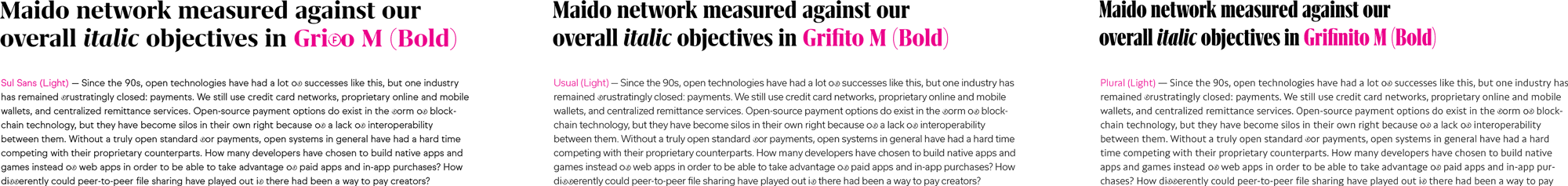
The feedback from the team after that presentation was that although more exploration was needed, everyone tended to lean towards the combination of Grifo and Sul Sans, both designed by Rui Abreu for R-Typography. (I was a little sad to not use DSType’s Breve superfamily, which I’ve been saving in my typographic back pocket for a few years now, but I agreed with the team that it leaned too heavily towards formality, and using the face for both serif headline and sans-serif body wouldn’t work.)
With a few of these choices, I did some quick-and-dirty experiments, manipulating the ‘M’ to introduce a curve that directly referenced the ‘M’ of Nouvelle Vague and therefore paid homage to Maido’s history — a way of not deviating too wildly from our established brand. Regardless of our eventual choices, everyone agreed that this would be a nice touch for the final logotype.

After that initial presentation, I went away and researched more typefaces — again, sticking exclusively within the confines of Fontstand’s offerings — and specifically did a bit more experimenting with the ‘sister’ families of Grifo — Grifino and Grifilito — throwing options back and forth via our Slack channel. They’re essentially the same typeface, but condensed and compressed versions (or extra-condensed if that’s your naming bag). Personally, I love it when a typeface comes in a variety of widths as well as weights (or exists as a variable font — but that’s for another day). Yes, it adds way more parameters to the mix, but once you’ve pretty much settled on a face, it’s useful to have some minutiae to debate, especially when considering exactly which variation you’re going to use for a logo.
But then Cambon happened.
Harry (one of our designers) pointed the team towards a Dribbble shot that used a typeface called Cambon by a new and little-known foundry called General Type Studio, run by designer Stéphane Elbaz (who’s also Design Director of the rather excellent website The Outline). It piqued my interest — and changed everything.

Here was a face quite dramatically different from the ones we’d been experimenting with, and yet still ticked the boxes: authoritative, but a little quirky; steeped in history, but modern. I threw around a few specimens, and although the team were a little reticent at first, over time everyone came to love Cambon, especially when they saw it in action on our website.

At the time of writing, General Type Studio has released just four typefaces, but another of those — a sans called Mier — just so happened to fit the bill for our body text: contemporary, friendly, kind of cool, not too serious. Plus, I’d been agonising about whether we should use Sul Sans for our body type given its uncanny similarity to Circular — would people even notice we’d made a change at all?

So I presented the final options to the team, with a recommendation for the pairing of Cambon and Mier. Everyone agreed, and after some further debate on which weights to use, we settled on Mier B Book for our body typeface (the ‘B’ version most notably has a double-storey ‘a’, and curved tails on the ‘j’ and ‘t’), with the ExtraBold weight for emphasis. It’s a personal preference, but I tend to favour greater contrast between normal and emboldened text, and the weight difference between the Book and ExtraBold provides just that.
For our headline type, we chose Cambon Black, but, in a perfect demonstration that branding is a moving piece of work even after all the decisions have seemingly been made and the recommendations documented, we got the website ready for relaunch and realised that the Black weight of Cambon was just too heavy for some of our smaller headings. True, we could’ve changed the size, maybe switched out to Mier B, or even just given them a different treatment, but we decided that needed another weight to offer us a little more flexibility. After a fair bit of internal debate largely centered around deciding whether we should opt for the next weight down from Black to optically suggest the same weight when used at smaller sizes, or intentionally pick a lighter weight for a more conscious contrast, we opted for the latter and chose Cambon Book.
(Sidenote: font weight names are arbitrary, and in my experience the ‘Book’ weight of a typeface usually sits below the Regular as a lighter version; in Cambon and Mier, it’s actually heavier. It’s not right or wrong either way, but it’s worth remembering these naming quirks when substituting typographic candidates.)

With our new typefaces chosen, and all arguments around the specifics of weights and styles settled, our branding work was done. Or was it? There was still the question of the logo, and actually it presented us with a problem: typing ‘Maido’ in Cambon Black somehow just didn’t have the same impact as it did when we were experimenting with some of the other contenders, largely because it’s not a particularly high-contrast face; i.e. the difference between the thin strokes and thick strokes is not that intense, or at least not nearly as much as a typeface such as Grifo, or our original typefaces Playfair Display and Nouvelle Vague.
To tackle this, I decided to manipulate the outlines of the type to create a greater stroke contrast. Although a little fiddly, I was already editing the paths for our own unique touches for the logo. I’ve mentioned the swash-y ‘M’ to hint at maido’s past; along with that, I added a ball terminal to the ‘a’, which was derived from the dot of the ‘i’. For both the ball terminal and that dot, I adjusted the angle of the ovals slightly to match the slant of the ‘o’. The ascender of the ‘d’ and dot of the ‘i’ were extended a touch, and all glyphs were negatively tracked a little (with custom kerning between the ‘M’ and ‘a’, and ‘d’ and ‘o’), resulting in a tighter feel all round.

However, another long-standing gripe with Maido’s original logo was how the thinner stems of the characters disappeared when the logo was used in decks or as an avatar, so one final bit of work that needed to be done to finalise our new logotype was to create a version suitable for use at small sizes — a ‘body’ optical style, essentially. Ironically, this involved adding some of that stroke contrast back in, as well as loosening up again some of that spacing that had been tightened. As with different optical sizes with type, the aim was to create two versions of the logo that felt the same when used at their intended sizes, but would have some noticeable differences if you compared them at a big scale, like-for-like. Like most things in typesetting, it’s really all about bending the rules a little for some reader-friendly optical illusions.

Typography aside, this was a good opportunity to give our website a fresh coat of paint, too. Some new content and imagery, some tidying-up (hello, new footer), and the integration of the blog into the website itself — but all with a focus on redefining who we are, with a renewed focus on our work in the social impact space. Again: evolution, not revolution.

So, the new Maido brand (hopefully) feels refreshed, somewhat more usable, and more accurate for who we are today. We hope you like it. And it’s also the first step in a much deeper rebranding process: a soft relaunch to close out 2019 before we go all in with our, er, hard relaunch in 2020. Watch this space.