The relevance of the baseline grid

In the talk I’ve been giving at conferences this year, With Great Power Comes Great Responsibility, there’s a section where I mention baseline grids; specifically, what I’ve learned from doing a large-scale print project like 8 Faces. However, until now, I haven’t really covered the subject on this blog.
This morning I was interviewed about typography for an upcoming issue of Computer Arts and I prepared some screenshots for them. In doing so, I realised that one example was even more thorough than the one I’ve been showing in the talk, and that the example deserved a blog post. So here we are.
Some context
I’d never really done print projects that were that big prior to 8 Faces, so I was — shamefully — a little lazy when it came to setting up and following baseline grids. The same was even more true on the web, since adhering to a baseline grid is considerably more difficult online, especially when dealing with ems and adaptive layouts (although not impossible).
Because of that, one of the original aims of 8 Faces was to give myself a much-needed kick up the bum, and I’m happy to say that it served that purpose remarkably well. Even better than I’d hoped, in fact, because upon returning to web design work, I found myself with a new-found appreciation for baseline alignment and have tried to carry over a lot of the principles from the 8 Faces design into my online projects.
The example
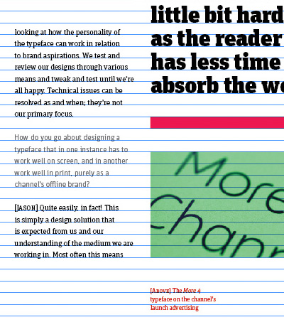
To actually see what I’m talking about, here’s a page from the latest issue of the magazine. If you hover over the image, you’ll see the baseline grid.
The body type (at 7.5pt / 11pt) dictates the baseline grid and then everything else aligns to it. The small red text uses incremental leading to match every fifth line of its own type with every fourth line of the body type. The pullquote’s type is sized so that the x-height of each character takes up one baseline increment, as does the height of the borders above and below the quote. The images, too, follow the same baseline grid.
Hopefully this example demonstrates how important the baseline is: it literally informs the rest of the design, from other type’s size and leading, through to image placement, border height, and even padding between elements (set here, most of the time, at two baseline increments).
The lesson
So I can line things up. Yay for me. But the lesson here is not that we should use baseline grids (I think that was established many moons ago), but that their presence in a design is something rather more important.
You will have heard this before from people much smarter than me (like when Tim Brown said we need to design from the type outward, or when Mark Boulton said that we should take a content-out — not canvas-in — approach): when you consider that the baseline grid is derived from a combination of the typeface’s x-height and your desired leading, it proves one very important point: typography is at the centre of absolutely everything we do.
