Ian James Cox
July 13th 2009 @ 10:31 am #
I don’t know why but I always like seeing other peoples drawn wireframes.
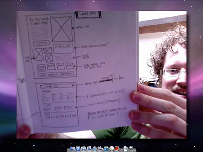
A few weeks ago Ryan asked me if I’d like to do a two-part screencast on designing online portfolios, and I thought it’d be a great idea, especially as — at the time — I was just putting the finishing touches to this new site. I also thought it’d be a good way of showing you some of the techniques I used rather than just writing about it on the blog.
So, if you’d like to see me rambling on and looking rather red-faced indeed (I blame a combination of a crappy iSight camera, an unbearably hot week, and my wild-man beard), head over to Think Vitamin to check it out:
By the way, if there’s anything particular you’d like to ask about the new site (why i did certain things, how I did certain things, etc.) that isn’t covered in the screencasts, please feel free to leave a comment below and I’ll answer as much as I can, either in a reply or a separate blog post.
Oh, and in case you didn’t know, the new Think Vitamin is now incorporated into the main Carsonified site, which was beautifully redesigned by Mike Kus. Mike, as well as being a lovely chap, is one of my favourite web designers and — in my opinion — one of only a few people brave enough to challenge the current web design norms. Although it brought a little tear to my eye to see the old Carsonified site go (designed by me when I worked at the company), I think it’s definitely a change for the better. Nice one, Mike!
I don’t know why but I always like seeing other peoples drawn wireframes.
Fantastic wee video Elliot, its nice to actually hear you talk through the process and show some examples.
In regards in image sizes and thumbnails for showing off portfolio work, do you have sizes that you prefer to use or do you just play it by ear depending on the Grid system ?
Regarding the Carsonified site; It feels like a US style presidential campaign pamphlet !?
Very interesting theory in web design. I like it! This is also interesting because I am also in the process of redesigning my portfolio and has led me to re-think some things.
Enjoyed during a sandwich break – especially the thoughts on researching portfolios in the wild.
Definitely an amazing screen cast… As a starting freelancer this gave me some amazing insight on how to approach certain subjects about website building and even settled some of my own quarrels with my own personal site (Currently under construction).
Elliot,
I’ve just finished watching the second installment of the series, I’ve throughly enjoyed watching them, and I noticed something that I’m not too sure about, I was going to post it on the Think Vitamin blog post but I have decided against it because either
1, I might be correct
2, I’ll be wrong and more people will point and laugh ;)
Anyway, I digress. At 14:53 into the video you mention how you have went about creating the span elements for your div.selected_posts. When you brought up the code I noticed that on ul li a span the display is set to none and then for the a:hover the display is set to block.
Could this be classed as an accessibility issue for people using screen readers and so on? Couldn’t you achieve the same technique by either setting a negative margin on the span or setting visibility to hidden on the regular state? I’ll admit to not being as clued up as other people on accessibility, one look at my own site will tell you that, I’m just interested to hear about the approach you have settled on and why.
Perhaps I should just stop over analyzing things. Yes, that sounds like a good idea.
Cheers for leaving your comments, guys!
@ Chris: No particular size, no. Instead I’ll give you the fantastically vague answer of “not too big, not too small.” ;) Seriously, though, I think it depends on the context of the image. I used quite a few for this site, partly to give variety and partly because I never found that perfect size!
@ Jack: No, you’re not wrong. In fact, this is a very good observation. As you suggested, a far more accessible option would be to use negative margins. I could also perhaps have used opacity, which would have the added benefit of having a fade-in on Webkit browsers (and would still appear for browsers that don’t support it). So basically, thank you for the suggestions — I’ll be implementing them when I (eventually) get round to my ‘tweaking’ session.
Hey Elliot!
I just now finished watching both of your screencasts and I’m glad I did. I’m currently redesigning my portfolio but I can’t seem to find a starting point, and I’m getting too many ideas …
Using the 960 grid system never occurred to me, although I have looked at it, in the past. In addition, you shared the swell idea to do lots of research and take the best parts you see from your favorite sites.
I think I’m going to have a *much* easier time redesigning and getting my ideas structured. Thank you for your screencasts and the time you put into making them.
Great tutorial. I’m creating my portfolio now and this is very helpful. Thanks!
This has helped me a hell of a lot! I am in the process of doing my portfolio site for a company launch at the end of the month so this will help me finally get the website right.
I’m also glad to know after watching your video that your book is going to be as good (which I bought yesterday).
Thanks!
Hi Elliot,
thank you for this very professional tutorial!
I’ve just re-designed my site and now I see there is a lot work to do again ;)
But that is the way the live goes on!
Thanks!
Hey Elliot,
Great tutorials, I enjoyed it!
I’ve recently completed my new Portfolio site like two days ago and I came upon this about 2 hours ago and was like ‘DOH!”…
Anyways if you have the time, check out my Portfolio and leave me some feed backs.
Btw, I like your Portfolio.
Recent Comments: