Posted on 24 June 2011 • 26 comments
During the research phase of a recent client project, I found myself creating some simple markup and styles to present the client with options for the project’s typeface and colour palette. On the assumption that I’ll probably re-use this code again, and in the hopes that someone else might find it useful, I thought I’d put it up here for people to download.
The premise is simple, but admittedly it’s for a pretty specific scenario, which is this: you want to try out some typeface ideas by rendering real fonts in the browser, using a font delivery service such as Typekit, Fontdeck, Google Web Fonts, etc. At the same time, you also want to test out potential colour palettes. You want to do this with minimum fuss and simple code this is easy to change once your client provides feedback, or when you re-use the code for your next project.
With me? Jolly good. Download the files.
Layout
The page layout is extremely simple: four floating divs containing text, with horizontal measurements declared in percentages and vertical measurements declared in ems to keep everything relative and highly flexible. To stop the line measure getting too short, a media query kicks in at 600px width to kill the floats and tweak a few margins. Yay, RWD!
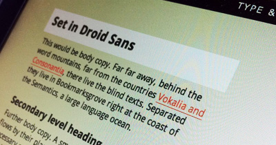
Type
If you look at the basic version of the page, you’ll see that each block of dummy content is set in a different typeface, with the fonts delivered via Google Web Fonts. That doesn’t matter, though: you could easily use any font delivery network. In the actual client project, I was using a combination of Typekit and Fontdeck to display the potential typeface choices.
The CSS, as you might expect, looks like this:
div.one { font-family:'Droid Sans', Arial, sans-serif; }
div.two { font-family:'Droid Serif', Georgia, 'Times New Roman', serif; }
div.three { font-family:'PT Sans', Arial, sans-serif; }
div.four { font-family:'PT Serif', Georgia, 'Times New Roman', serif; }
Colour palette
I like to establish a palette with at least four base colours that includes one high-contrast accent colour (usually for links), and declare them in the comments (purely for reference) before assigning them to selectors, so you’ll see that in the CSS:
/* Palette 1
Background 1: #f2f3ed
Background 2: #fff
Body: #333
Accent: #ff5d52
*/
View: our page, using palette 1
Using a body class allows me to throw numerous colour values into one stylesheet and then just duplicate the HTML page several times, simply changing the body class with each new version. Super-easy to adjust after client feedback and super-easy to re-use for the next project.
body.palette-one { background:#f2f3ed; color:#333; }
body.palette-one a { color:#ff5d52; }
body.palette-one div p:last-child a { background:#ff5d52; color:#fff; }
body.palette-one div p:last-child a:hover { background:#000; }
Here’s palette 2; the only difference is the body class in the markup, so you use body.palette-two instead of body.palette-one.
Again, here are the files.
That’s all, folks. Hope this proves useful in some way!
26 comments
Hamish M
24 June 2011 @ 05:34PM #
Fantastic work Elliot, thanks for sharing!
You know, you should get a repository on GitHub and put it up there. That’s what all the cool kids are doing these days. ;)
Chris Enns
24 June 2011 @ 05:39PM #
Nice! Thanks Elliot for posting/sharing this. Definitely will come in handy on projects.
Jamie Brightmore
24 June 2011 @ 05:41PM #
Top man! Cheers ; )
Davor
24 June 2011 @ 05:42PM #
Thanks for sharing this Elliot! It will surely be very useful to many of us for our future projects :)
Michael Parenteau
24 June 2011 @ 06:07PM #
Wow. I literally after AEA in Atlanta was working on this very thing and it is up on github… it is not nearly finished… but it was more of a “select the font” and replace some heading text, paragraph text… but in a layout context. You know, so you could see different rhythms of textin narrow and wider columns.
here is where I am so far. It should get better.
http://github.com/michaelparenteau/typecaster
Gonzo the Great
24 June 2011 @ 08:01PM #
Hi Elliot,
This is a good way to let your customer choose typeface, colorscheme (links and hover), etc. – I’m doing this ever since I started to work with @font-face (and Google fonts – The more webtypes, the merrier!).
In my experience this is the best way to let a customer choose his/her palette for their website. Thanks for sharing, Cheers & Ciao ..
Anthony
24 June 2011 @ 09:12PM #
Great stuff man! I appreciate you sharing with us.
vamsi
26 June 2011 @ 04:35AM #
Thanks <3
Awesome stuff !
marsha
26 June 2011 @ 01:59PM #
Just diving into CSS. This is just a brilliant way of working.
Thanks for sharing, Elliot!
Christopher Supnig
26 June 2011 @ 02:49PM #
This helped my very much… thanks for sharing!
Matt Hamm
27 June 2011 @ 12:18PM #
Thanks Elliot. This is actually really useful. Great idea.
Dave Sherratt
27 June 2011 @ 12:26PM #
Loving this makes it much clearer for the clients, only thing I may add would be a drop down option for colouring and what not? Also possibly a web/mobile view instantly would be nice for the client to quickly see the difference
prisca
27 June 2011 @ 12:34PM #
Thanks for sharing this, Elliot – got something similar myself which is in need of an update. Now, with your files, much easier done ;) thanks ;)
fin
27 June 2011 @ 01:40PM #
Very nice. I reckon I will use this for making decisions about sites I am making just for myself.
Magnus Forsberg
26 June 2011 @ 10:52PM #
Nice one Elliot, simple and useful.
Matthieu
29 June 2011 @ 08:21AM #
Thanks a lot for this, very helpful!
Grant
29 June 2011 @ 08:55AM #
Great find – definitely one I’ll be testing and using out!
gavaskee
29 June 2011 @ 08:56AM #
Nice one. simple and clean.
malachowski
29 June 2011 @ 10:10AM #
Great stuff mate! Thanks for sharing.
luca
29 June 2011 @ 10:11AM #
Great !! Very useful, thanks !
Darren
29 June 2011 @ 10:33AM #
Thanks, very useful.
Perfect for getting the feel of a site before getting stuck in.
Lars Spaan
29 June 2011 @ 10:24AM #
Thanks for sharing this.
Chris Lorensson
29 June 2011 @ 11:21AM #
Cheers Elliott, will be using this today!
Tom Hermans
29 June 2011 @ 12:57PM #
Handy, was thinking about something similar, also like the comments about further customization..
Starts new ideas ;)
ToM.
Jax
29 June 2011 @ 01:11PM #
Luv it!
Thomas O'Rourke
07 July 2011 @ 11:34AM #
I found Google Fonts a while ago and I’ve never looked back! My favourite (thus far) has to be Copse: http://www.google.com/webfonts/family?family=Copse&subset=latin
This is an interesting way in which to preview colour schemes and typefaces for clients. I’d never really thought about doing something like this in the past so it’s very handy – thanks Elliot.