A new elliotjaystocks.com
Posted on 23 September 2011 • 55 comments
At some point late this afternoon, in what can only be described as a moment of madness, I decided to drop all of the tasks on my plate — tasks which, without a shadow of a doubt, deserved the highest priority — and redesign my website. Unless you’re reading this in an RSS reader, you’re now witnessing the result of the last few hours’ work.
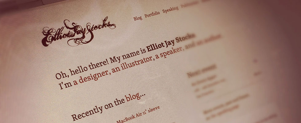
I’ve been frustrated with my site (the version shown in the screenshot above) for a long time now and a redesign attempt has been going on for the best part of a year. However, I decided to ditch all of that and start completely from scratch, designing purely in the browser, with the aim of getting a new design live before bedtime. I’ve just about managed it. Things will probably be a bit ropey for a while: images need resizing, baselines need aligning, and browsers need testing, but for now, I’m happy. The purpose of this redesign is that it’s undesigned. There’s virtually nothing to it: the focus is almost entirely on the type.
My apologies to my good friend and studio mate Jon Tan, because I completely nicked his idea for using only one font size throughout the site.
I’m not sure what straw it was that broke the camel’s back. I think it was that I’ve been writing about typography and responsive design for a while now, and it seemed oddly hypocritical doing so on a site with such terrible typesetting and absolutely no responsiveness. Redesigning was a necessity, and that’s probably what prompted me to do it so spontaneously. It’s also what prompted me to ditch the redesign I’ve been working on for the last few months: it was okay, and it was adaptive, but it wasn’t fluid, and therefore not fully responsive. It had to go.
As I write these words, it’s nearing 3am and my eyes are beginning to close, so I’ll leave further comments until tomorrow. However, one thing I will say is this: to all intents and purposes, this site is purely a blog right now. I’m still working on my portfolio, but as I’m not seeking new client work until summer 2012, I’m in no particular hurry to rush it out the door. The same goes for the speaking and publication pages: they’re in the works, but they’re not priorities. The blog (and general redesign) was a priority, so here we are.
Enjoy! I’ll probably hate it by the time I wake up.
Update: In the few days since posting this, I’ve made several tweaks to the design; some big, some small. If you’re interested, you can find notes in these comments from me: 1, 2, 3, 4.
55 comments
Dan Rubin
23 September 2011 @ 02:58AM #
I love it. Personal space on the web is much like an artist’s personal workshop — a place for experimentation and expression, without boundaries, rules, or obligations.
As someone who has needed a good late-night redesign for a few long years, you may very well have just lit a fire under my lazy bum :)
Carl
23 September 2011 @ 02:59AM #
“Enjoy! I’ll probably hate it by the time I wake up.”
I know that feeling!
Mike Healy
23 September 2011 @ 03:17AM #
“the focus is almost entirely on the type.”
That would be true if it were not at 40% opacity! I can hardly see it.
Otherwise tidy work.
Tyce Clee
23 September 2011 @ 03:21AM #
I applaud your spontaneity Elliot, and simplifying the overall design of your site. It takes balls to design with less, rather than more..
Gabriel Izaias
23 September 2011 @ 04:14AM #
A little bit more contrast would be nice!
Ryan Giglio
23 September 2011 @ 04:24AM #
I’m liking the simplicity of it compared to the old site, but I’m having a really hard time reading everything. The body text already has very low contrast and the footer is even worse.
Simon Clayson
23 September 2011 @ 06:20AM #
A familiar tale, at some point with any project, you just have to do something – clear the decks and get something out, and yes, it’s difficult to say one thing but you’re own site doesn’t walk the walk.
I love the one size thing, it’s really nice – the experiment on my site is with one weight and I think I must have nicked the philosophy from Jon, it’s all coming back now.
Michael Raffaele
23 September 2011 @ 06:49AM #
Have to agree with the earlier comments regarding contrast as I am struggling to read your content especially on this crappy workstation I’m using (old win xp box), although it is much better on my mba.
That aside, I really do love the cleanliness and openness you have with this new layout.
eezequiel
23 September 2011 @ 02:57AM #
How refreshing! Looking forward to see the adjustments and decisions you’ll make!
My two cents: Maybe a little more contrast on the body type. It looks a little washed in my laptop.
Cheers from Argentina!
Hamish
23 September 2011 @ 07:52AM #
Simple and clean. Good work Elliot. Although it does lack a lot in the contrast department, I too am having a hard time reading most of the body text.
Joke de Winter
23 September 2011 @ 08:50AM #
Nice touch on the iPhone with pink hover states on the links.
Jon Tan
23 September 2011 @ 09:02AM #
Thanks for the credit, Elliot. :) Skolar, I note, too. Great start, long may the fun continue!
Elliot Jay Stocks
23 September 2011 @ 09:27AM #
Thanks for all the comments, guys! I’m actually really surprised that this has received such positive responses so far. I really appreciate it!
I’m not one to bow to peer pressure, but as so many of you mentioned the contrast — and because, with (relatively) fresh eyes this morning, I agree with you — I’ve made all text a little darker.
Ethan Marcotte
23 September 2011 @ 09:31AM #
You did this in an afternoon? I hate you so much.
(This is just lovely, Elliot—congratulations! Can’t wait to see it evolve.)
Rick Hurst
23 September 2011 @ 09:41AM #
Looking forward to see it evolve Elliot – i’m a fan of minimalism, so I hope it doesn’t evolve too much! On that note – does the ad income really justify them being there? Some of the ads blend in, but others are really distracting and spoil it..
Jason Stone
23 September 2011 @ 09:50AM #
Sweet, I like it :D
Looks beautiful on the iPad too, good work Elliot! Interested to see how this evolves :)
David Hellmann
23 September 2011 @ 10:04AM #
it looks very clean. i like it. the font is nice but i think it is a bit to small to read.
Rahul Sharma
23 September 2011 @ 10:09AM #
Nice Redesign, very neat… But put back that beautiful logo of your name from your old design… that looked killer…
and also increase the text size bro.. its a little too small to read…
Rest… this redesign is super clean… just love it! :)
abdusfauzi
23 September 2011 @ 10:12AM #
it seems that, everything just about to go back to basic: start structure and base, then move forward with graphics and colouring.
by the way, nice font face!
David Airey
23 September 2011 @ 10:17AM #
My type of design. Nicely done, Elliot. I particularly like where the image bleeds on the left — on your “about” page, for instance.
Kevinjohn Gallagher
23 September 2011 @ 10:41AM #
Hi Elliot,
If I could add two small critiques:
1) The font is so light that I can hardly read it. I actually had to adjust the contract of my monitor just to reply to this.
2) One font-size is a brave move, and I’m sure you can pull it off, but could you possibly make it bigger? 12px text for such a small/specifc/non-windows-friendly font is not that ideal…
Still a huge fan of your work, and the idea behind this, but it’s a little difficult to read (sorry).
Kev
eezequiel
23 September 2011 @ 10:49AM #
How refreshing! Looking forward to see the adjustments and decisions you’ll make!
My two cents: Maybe a little more contrast on the body type. It looks a little washed in my laptop.
Cheers from Argentina!
TheFella
23 September 2011 @ 10:55AM #
Looking good, although I agree with the font size; by the time I’d finished the article, I found that I was leaning forward and inches from the screen.
Elliot Jay Stocks
23 September 2011 @ 12:15PM #
Thanks for all the feedback, folks. I’ve made some further adjustments based on the comments above and several tweets from you fine people of the interwebs: the type is now larger (everywhere), with everything sized at 1em (16px equivalent), with the exception of the comments, which are sized at 0.875em (14px equivalent). That — along with the opacity change I mentioned earlier — should hopefully make things a bit more legible.
Rahul Sharma
23 September 2011 @ 12:31PM #
Looks so much better now… with those minor improvements
I always love clean and minimalistic designs!!! :)
Ed
23 September 2011 @ 12:33PM #
Looking very well now. Font size and opacity are fine after your latest adjustments. Very clean layout, can’t believe this took just one afternoon and a long evening :) Great job!
Jon Phillips
23 September 2011 @ 05:07PM #
Good move on making the type bigger and a bit darker – looking forward to seeing what else you got cooking :)
Terris James Kremer
23 September 2011 @ 08:11PM #
You sir, are gentleman and a Skolar. Muahha!
Elliot, you never fail to impress me – this is type mastery. Thanks!
Ludvig Lindblom
24 September 2011 @ 11:14AM #
Bold move using one font size, but it payed off. Looking sharp.
And after you changed the contrast, I can’t find anything to nag about.
Josh
24 September 2011 @ 03:17PM #
Fantastic work Elliot, I love the new design! So glad you increased the contrast too.
I have a question for you; have you thought about using an arrow instead of a Guillemet for your ‘Continue Reading’ links as Guillemets are used as quotation marks in some languages?
Pat Dryburgh
24 September 2011 @ 05:52PM #
Caught this on my iPad, and it looks lovely. I really appreciate how Dan described it—a personal workspace. This has given me a lot to think about as I consider my site’s design. Congrats on a job well done.
Ben Norris
23 September 2011 @ 06:55PM #
Liking it, understated elegance is a good look …
Sharif Hamdy
23 September 2011 @ 10:30PM #
great work !!
you have done well, you have done a tremendous effort which shows your experience in web designing , keep it up . we are also developing and designing websites, just because we like to give our expertise in web designing and developing. Its really glad to hear from you. We are in the habit of developing and implementing suggestions. Autson works with innovative ideas to bring in new variations. your useful info will be helpful to get an idea..
We are here wow.autson.com
Elliot Jay Stocks
24 September 2011 @ 07:43PM #
In addition to the type contrast / size updates from yesterday, I’ve just made a few more modifications:
Hurrah!
Cameron Koczon
25 September 2011 @ 06:20AM #
Well done, sir. I’m going to buy you a celebration beer when I see you next (conveniently just 2.5 weeks from now).
dtamas
25 September 2011 @ 09:03AM #
Nice, simple, clean and responsive. Good work!
Michael
25 September 2011 @ 11:06AM #
I like this one much more than the previous design. It looks less designed than it looks “felt” and made without the need to fulfill any guidelines or other rules of good design. I think, developing/designing is better at 3am. ;-)
(Yet still I think that the huge padding on this very comment-form is a bit of an overkill…)
Toby
25 September 2011 @ 03:09PM #
Good work, I like it. My only comment is the underline used in links seem a bit far away from the text they are underlining.
Mariusz
25 September 2011 @ 06:22PM #
That’s something I plan to achieve with my new website that’s in the works – maximum readability and simplicity with minimal effort possible. Nicely done, Elliott!
marc
26 September 2011 @ 06:46AM #
Hey Elliot. Nice start. Like the light and clean approach. Also a beer from me, when we meet next time (which could take some time as you don’t like to speak at my small and cozy event evil-grin)
Looking forward to see the next steps and also am excited if Vitaly is giving me a sneak peek when I am in Freiburg soon.
/marc
Elliot Jay Stocks
26 September 2011 @ 12:29PM #
A few more changes from this morning:
html/bodybackground colours now mark off the ‘content’ area of the site once thebodyreaches itsmax-widthof 1200px. In other words: this is only needed when your browser is larger than 1200px and so you don’t see it until then.Stephen Dixon
26 September 2011 @ 02:26PM #
Elliot, I mentioned this a few moments ago on Twitter but I felt a much better description was required. I’m in awe of this wonderful redesign of yours.
The colour palette is fresh and the further changes you’ve made to this design have indeed improved it.
Now on to the responsiveness. I’m a big believer that as an industry, we’re teetering on the edge of something pretty big. A shift in paradigm, perhaps, when it comes to designing for the web. What responsive web design teaches us is that long gone should be the days of just designing purely for the desktop computer but paying close attention to the other devices out there, which have usage statistics that rival that of desktop computer usage.
Whilst responsiveness works, personally I think that when we get down to the dimensions of mobile screen sizes, we should then start to consider what the best user experience will be. I’ve asked a number of folks whether they would enjoy browsing a website that is responsive (and given them examples) or whether they’d prefer it if it were laid out almost like an app. They all voted for the app-based layout.
Either way, fantastic job on the redesign as it surely is an improvement on the last and here’s to the monumental effect that responsive web design is having on the web design industry!
Suleiman Leadbitter
26 September 2011 @ 03:56PM #
Looking sweet & sexy Elliot.
The site that is.
That black bar is reminding me of the current Think Vitamin site though :P
Nathan Leigh Davis
26 September 2011 @ 04:26PM #
Loving the site updates, particularly the little tweaks coming through now, such as the CSS transitions on this textarea I’m typing in now. Nice!
Loving the use of Skolar especially. Just a beautiful type family that lends itself to the way in which your using it. I’m going to disagree with a few comments though – the link styling is fine. Nothing nastier than underlines colliding with descenders.
Jim Walsh
26 September 2011 @ 10:14PM #
I agree that your personal site should be a place for experimentation and even a place to demonstrate the things you are speaking about. Although I’m not a huge fan and think some of your older designs were more visually attractive. I think there are some great ideas in use here. It just feels very much like a whiteboard with some text on it.
jaypegams
26 September 2011 @ 11:38PM #
Really love the redesign. Beautiful work
Sindre Olsson
27 September 2011 @ 09:06AM #
I love simplicity! It is lovely!, like the choose of color. Love to se the progress!
Joseph Daily
28 September 2011 @ 12:22AM #
Thank you for doing this. My own site needs to be ‘undesigned’ pretty badly, and I couldn’t have stumbled across this at a better time. Best wishes!
Stéphane Lambion
28 September 2011 @ 12:53PM #
As I told you a little ago, I really love this new version. Much cleaner, definitely nicer, … Yeah, you definitely made a great job here.
On the other side, you should remember that you have always been known in the domain of web design for your designs with a great visual impact, so you can imagine what a change a website like this one can represent!
As far as I am concerned, I have always loved minimalistic designs, because it is my personal style, and I think content has to be content, design has to be design. Sometimes, the desgin just becomes the content, and that is where many designers fail.
Anyway, congrats for your redesign, and I am looking forward to coming back soon!
PS : the menu is well integrated, I wouldn’t have thought to something like that, but it is pretty good.
kebryan
29 September 2011 @ 12:50PM #
la pieza muy buena
http://www.freepornclp.com/
suriya
Adham Dannaway
10 October 2011 @ 04:13AM #
Liking the new design Elliot, great work. I still feel like there should be more variation in font size to emphasize hierarchy on the page but that’s just a small thing. Nice work :-)
Sindre Olsson
18 October 2011 @ 12:56AM #
Love!
Sindre Olsson
18 October 2011 @ 10:47AM #
Love!
Milena Böhm
21 October 2011 @ 03:26PM #
Nice and clean! I like it! As stated somewhere in the first comment: “Personal space on the web is much like an artist’s personal workshop…”. We love to be your guests. It is quite bright around! :)
Ian Miles
24 October 2011 @ 10:27PM #
Ooops, didn’t saw the comments option.
I sent the bug straight to your twitter, elliot. ;)